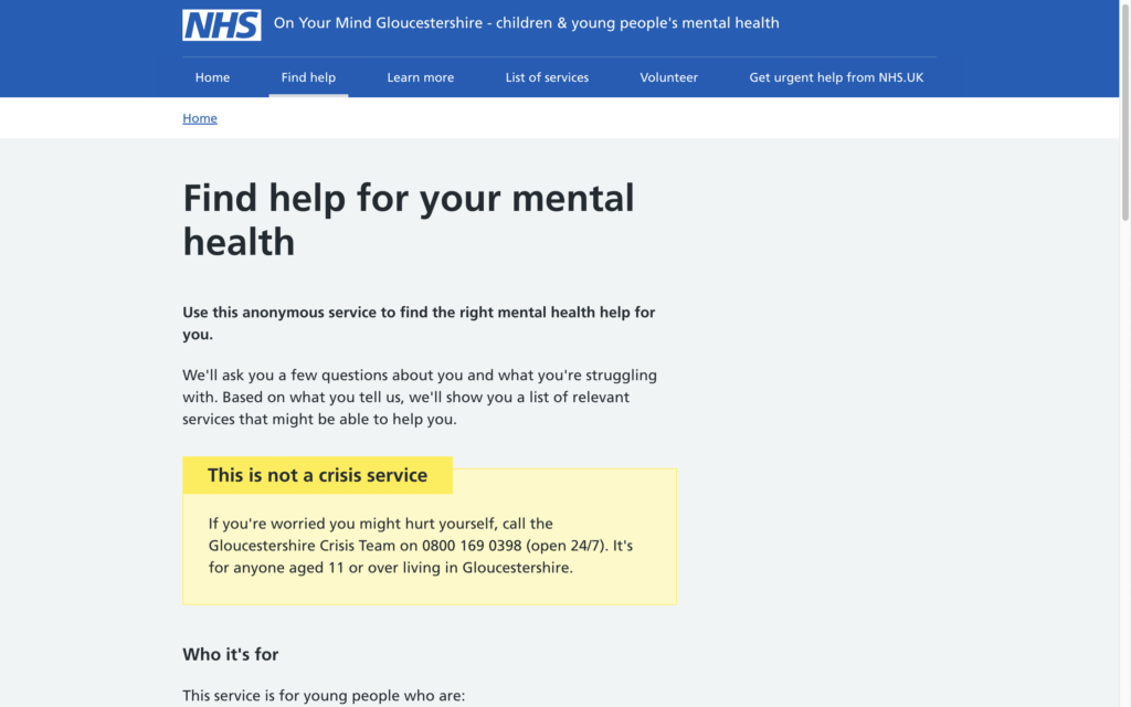
In early 2021, we began an 8-month journey to create a digital mental health support finder tool for children and young people in Gloucestershire. It’s a hugely-important service that helps people get the support they need more quickly and easily by identifying and signposting to the right service for them. You can read more about it at Building Better Health Care or get the quick overview in our case study.
In this post, we want to dive into a really interesting and challenging part of the project: the SMS text messaging interface. Though the main service is fully accessible online, the team wanted to make sure it was available to as many people as possible, so we also built an SMS text messaging interface for people who, for whatever reason, are unable to access a computer or smart device. In this post, we want to explore why we built this channel, and the challenges we faced along the way.
Making mental health services for children and young people as accessible as possible
Gloucestershire has a wide range of mental health services. The services help young people with depression, problems with food and eating, self-harm, abuse, violence or anger, and anxiety, among other difficulties. So it’s really important that people are able to get to the right support service as quickly and easily as possible. It’s this signposting that the service was designed to do.
As you’d expect, the team built a web service based on multiple-choice questions to make the service as easy to use as possible. The user research team also identified that an SMS text messaging interface was vitally important in making the service as accessible as possible. Though we don’t necessarily anticipate the text messaging interface being in high demand, it’s an important way to make sure the service is accessible to as many people as possible.
This includes people who don’t have access to a computer or smart device – but also, crucially, people who may be prevented from accessing those devices. Given this context, we were keen to put time and effort into this channel to make sure that no one gets left behind.
Creating a fully-functional CMS
A key part of the project was to create a new content management system to manage the information users engage with when they use the service.
The questions posed to users were developed alongside clinicians, and were hard-coded for both the web and text service, which means it can’t be readily changed. So we had to make sure this information was 100% accurate, and get it signed off by the risk management team. Getting this to work for the text as well as the web service was probably our single biggest technical challenge on this delivery.
Behind the scenes, both services rely on the same information, but it’s presented to the user in very different ways. On the web, multiple choice questions are a good option, but with a text service the user needs to reply to a series of questions with a word or a number.
These different interfaces pose significant challenges for managing the underlying information and it took a lot of user research to get this right. Mace & Menter provided user research for the whole project, and derived which “tags” were attached to questions, forming the basis of the design of the question and answer algorithm which we went on to implement.
The combined work of Mace & Menter and NHS Gloucestershire helped us rapidly iterate through discovery, alpha and beta phases, and user research insights were indispensable for the text part of the service in particular.
SMS limitations
The text component was most difficult to implement. We were fundamentally limited to a total of 918 characters (6 text messages’ worth) in any one interaction, so we had to make sure all questions and instructions were under 918 characters at a time or they wouldn’t send.
This presented a UX challenge. We had to meet the character count while making sure all information users would need is clear in each message. Web content was easier to edit because there was no word limit and a lot of the information was freely available on the NHS site.
We integrated with GOV.UK Notify to handle the messaging. This lets public sector organisations send emails, text messages and letters to their users. It solved so many problems for us right from the outset, but did present a few challenges when testing and demoing.
For example, before going live, we were limited to sending a total of 50 messages a day, of 160 characters each. Again – some questions spanned multiple messages due to their content, so we’d often use up our allowance in the testing stage, and by the time we got to demos, the service wouldn’t actually work. This mainly meant we had to be a bit strategic on demo days, but wasn’t a limitation when the service went live.
Though the service is called GOV.UK Notify, its ability to allow replies from end users was absolutely essential. Harnessing this functionality is a big reason we felt that we fully embraced the power of the service.
Throughout this work we fully embraced AWS Cloud Services and AWS Managed Services wherever possible (focusing on ECS, ECR, RDS Aurora, DynamoDB, Codepipeline, S3, AWS WAF V2). Using this tech across our hosting, integrations, release, and storage needs allowed us to create a truly reliable, scalable, and secure service that puts the needs of people first.
A template for future projects
This was the first time we’d worked on a mental health project for children and young people. On the whole we were able to work in the agile manner we strive for. We successfully responded and adapted to new requirements as they came in.
Making sure everyone was aligned on desired user-outcomes and specific technical requirements for content management in a clinical setting, and how it was set up, was challenging. The need for clinical safety is paramount, and we quickly learned that this means much extra time is needed to make sure the content is right the first time.
We now have a better idea of how much time we need to spend with the wider team to make decisions. For example, we’ll bring the developers in earlier to help us ask the right questions to identify user needs.
We filled out loads of clinical governance forms throughout which expanded our knowledge of the clinical risk process, and helped us figure out people’s responsibilities. But there were governance layers that we didn’t anticipate, which did slow us down somewhat.
Understanding the process for clinical governance was another learning point for us. We learned that working with the governance team in parallel on these approvals helped to speed up delivery. As partners, we needed to be aware of the clinical governance approvals that needed to be in place, and as a blended project team, we found it was most effective to get the ball rolling on governance approvals as early as possible, as these important checks can take a while to get right.
Involving governance partners and approvers from the start means there are no big surprises for anyone that might be showstoppers. We learned that it’s important to talk to your governance teams as early as possible so everyone is in the loop and ensuring what is built will meet all the checks.
We’re now in a better place to identify hurdles as early as possible, and make sure the right checks and balances are in place. We’ll draw on these past experiences to identify challenges earlier on so we can mitigate them, and use our work with the NHS in Gloucestershire as a template. This will free up time to focus on other challenges and build on our previous success.
Our main takeaway from all this is that delivering projects that provide clinical services to the people that need them can be incredibly rewarding. But you need to plan things out carefully.
Making the best possible version of technology
We’ll know more about the impact of the service when it’s been live for a while, but what we can say right now is the process itself was super-fulfilling. We had really good relationships with the stakeholders in Gloucestershire, who were fully engaged throughout so we could collaborate to build the best possible service. Being aligned on our goals and objectives helped to ease the strain on the challenges we faced.
Even though it was difficult at times, we kept reminding ourselves of its importance and how worthwhile it was to create something that can help so many young people get the help they need quicker and more efficiently.
Visit our health and care page if you’d like to read more about how Made Tech delivers technology projects in the health sector.


