“So we don’t fall behind while you’re on leave, we’ll all just have a go at writing the content.”
Comments like these can devalue the work done by content designers. We can do it for you – because everyone can write, right? But writing is only one part of content design.
But words are the service, aren’t they? Yes. A service needs words. Filling out a form with no words on it is hard. But is it enough to just add some instructions and leave it at that? No, there’s much more. Let me explain.
The 5 planes of content design
My colleague Helena Rix, recently gave a talk about the 5 planes of UX – which often act as a guide for content designers. This framework, by Jesse James Garrett, outlines the process that takes a project from an abstract concept to a concrete product. In the diagram below, content design is the “product as information” column.
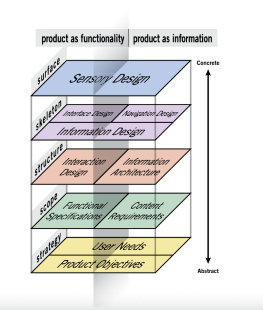
Before we explore each plane in a bit more detail, here’s a quick summary of each:
- surface is the last, most concrete stage. It is the sensory experience of the product – the words that the user will see or hear
- skeleton plane is where we define how information is arranged so users can navigate through and understand it
- structure relates to the way information is organised, categorised and labelled
- scope is where content requirements of the product are defined
- strategy is the most abstract stage where the objectives of the project are decided upon
Oz Chen explains more in “The 5 Planes of Content Strategy”.
Let’s dig into each of the 5 planes a bit deeper and explore why content design is so much more than just the words.
Strategy
Governance
A large organisation might have many teams producing content. So, let them crack on right? Well, no. It’s not a great decision to allow everyone to pebbledash content all over the organisation’s digital platforms and here’s why.
A good strategy guides and controls what teams do and how they do it so that all content stays on-brand and in good shape. For good content strategy, we need to ask questions like:
- why is the content needed?
- who is it for?
- who monitors and removes out of date content?
- how is success measured?
These questions form the basis of the rules (governance) for content creation. It helps us implement the strategy and keeps content relevant.
Accessibility
Having a good content strategy in place also supports accessibility. If products and services aren’t accessible to everyone, they’re not meeting user needs. Some challenges that content designers need to consider are that:
- the UK average reading age is 9 to 11 years
- people are often time short and need information fast
- when in need/vulnerable, people don’t have bandwidth for complication
This means that content designers need to be involved early in the process. Sometimes the content for online journeys is designed as an afterthought. All the boxes and buttons are on the screen and at the end, the content designer is asked to fill in the gaps or replace the dreaded ‘Lorem Ipsum’. Cue content designers everywhere screaming into their pillows! Get us in early so we can help make sure there’s a good content strategy in place from the very beginning.
Scope
Now the scope plane. This is all about deciding what work will and will not be done. There’s a few questions to get you started when it comes to deciding your next steps:
- what’s essential?
- what’s nice to have?
- what shouldn’t be done?
While this may sound like quite a lot, content designers break it down by choosing which types of content to use by looking at:
- user needs
- the desired outcome
- time/effort required
- constraints
- evidence based content patterns, like readability guidelines or the Government Design System
Structure
Too many user journeys are more complicated than they should be – which is not great for users. Information can sometimes be hidden under too many layers or in a place you don’t expect. Sometimes links don’t work or lead you on frustrating, circular journeys.
When we talk about structure in the 5 planes of content design we’re talking about information architecture (IA). IA is the organisation of information. For example, putting all career-related information into a careers section of a website – so it’s easy to find. Or creating logical, easy to follow links. A common example you’ve probably seen is navigating a website and finding links to ‘what it’s like to work here’ from the ‘current vacancies’ page. IA uses a range of techniques including:
- logical hierarchical structures
- categorising information
- defining relationships between pieces of information
- naming conventions (taxonomy)
Content designers wrangle this information into a logical order. They design a plan for how to build a product or service or how to bring it back under control. All of this aims to help get the user what they need. This is your content structure.
Skeleton
The skeleton plane is about how a user interacts with a product or service. There’s 2 areas that fall under this – navigation design and information design.
Navigation design helps the user to find what they need – easily. A content designer considers how to effectively use website components like:
- flows
- menus
- breadcrumbs
- filters
- links
- footers
A user needs to be able to navigate easily to information that relates to what they’re seeing. If you’re visiting the ‘about us’ section of a website, links to in-depth technical information would be less useful than links to pages like:
- our values
- meet the team
- how we are run
- what it’s like to work here
Information design is therefore how to communicate information so anyone can easily understand or get what they need. I was recently asked to redesign a job application form. A question about eligibility to work in the UK was right at the end. This was frustrating for candidates who spent time on the form, only to then find that they weren’t eligible at the end. Changing the order of questions made it a much smoother process for users.
Surface
This is where the writing happens. So what helps us choose the right words? There’s a few things that are on every content designer’s checklist.
Research
Research can tell us:
- what language users already use and understand about the product/service
- what language causes pain points
- where there are gaps in the users’ understanding/knowledge
- where the current provision does not meet users’ needs
Do no harm
Many words and phrases have come from oppression, so we need to replace them with something better. A good example here is in her speech to Config 2023, Candi Williams talks about ‘deceptive patterns’ instead of ‘dark patterns’. She says it is more inclusive but is also clearer in its meaning.
Be inclusive
Being user-centred means no one is an edge case. Everyone’s lived experience is different. Giving the most vulnerable people what they need, makes the service better for everyone.
Plain English
Some writing jobs require a ‘way with words’, clever one-liners, funny quips or persuasive prose. Content designers focus on writing in a way that’s easy for everyone to understand. That doesn’t sound too difficult, I hear you cry. But it’s not just a case of taking some writing and re-wording it. We must gather, understand and distil complex information. In the surface plane, we turn it into words that users experience with minimal stress or effort.
Content design is so much more than writing
So there you have it, content design is not just about writing. It’s a ‘full stack’ kind of situation. By all means step in to help if your team’s content designer is swamped or away on their holidays. But be prepared to dive deeper than just writing the words.
If you’d like to learn more about all things content and user-centred design, take a look at some of the recent blog posts from the team.
